
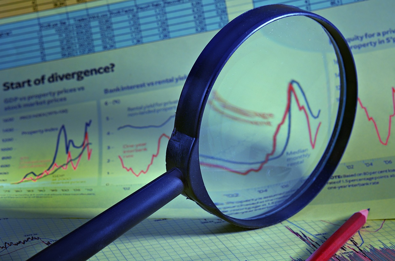
How to Read and Understand Exchange Charts
Understanding exchange charts is crucial for anyone venturing into the world of trading, whether you're a novice just dipping your toes in or a seasoned trader looking to sharpen your analytical skills. These charts serve as a visual representation of currency pair price movements over time, offering insights that can significantly impact your trading decisions. Imagine trying to navigate a bustling city without a map; that’s what trading without understanding exchange charts feels like. By familiarizing yourself with the different types of charts and their components, you can navigate the complex landscape of trading with greater confidence.
Exchange charts are your window into the market, allowing you to see historical price movements and trends at a glance. They can be likened to a heartbeat monitor for a trader; the fluctuations indicate the health of a currency pair. By analyzing these movements, traders can make informed decisions on when to buy or sell. The beauty of exchange charts lies in their ability to distill complex market data into something visually digestible. However, understanding them requires not just a glance, but a deeper dive into their various types and components.
When it comes to exchange charts, there are three primary types that traders commonly use: line charts, bar charts, and candlestick charts. Each type has its own unique advantages and can provide different insights into market trends and price action. Let's break them down:
Line charts are the simplest form of representation for price movements over a specific period. They connect closing prices with a continuous line, giving you a clear view of overall trends without the distraction of intraday fluctuations. Think of it as a straightforward narrative of the market's journey over time. If you want to grasp the general direction of a currency pair, line charts are a great starting point.
Bar charts take things a step further by providing more detail. Each bar represents a specific time period and displays the open, high, low, and close prices. This format allows traders to assess market volatility and price ranges effectively. Picture a bar chart as a detailed diary of price action, revealing not just the closing price but the entire story of price movement within that timeframe. This level of detail is invaluable for traders looking to understand market dynamics more thoroughly.
Candlestick charts have gained immense popularity among traders due to their visual appeal and the wealth of information they convey. Each "candle" represents price movement within a specific timeframe, and the body of the candle indicates whether the price closed higher or lower than it opened. These charts can reveal market sentiment and potential reversals at a glance. If you think of candlesticks as vibrant paintings, each one tells a story about the market's mood and can provide clues about future movements.
To make the most of exchange charts, it's essential to understand their key components. This includes the price axes, time frames, and various indicators that traders use to enhance their analysis. Let's explore these elements in detail:
The price axis on a chart displays the value of the currency pair, while the time axis represents the duration of price movements. By analyzing these axes, traders can identify trends and potential reversals. It’s like reading a road map; the price axis tells you how far you’ve traveled, while the time axis indicates how long it took to get there.
Different time frames—such as daily, weekly, or hourly—offer various perspectives on price movements. Choosing the appropriate time frame is crucial for aligning your trading strategies with market conditions. Think of it as adjusting the zoom level on your camera; a wide-angle view might show you the big picture, while a close-up can reveal intricate details that could influence your decisions.
To further enhance your chart analysis, technical indicators like moving averages and the Relative Strength Index (RSI) can provide additional insights into price trends and potential entry or exit points for trades. These tools are like the secret sauce of trading; they can elevate your analysis from good to great.
Moving averages smooth out price data over a specific period, helping traders identify trends and potential support or resistance levels. They are essential for making informed trading decisions. Imagine moving averages as a gentle breeze that clears away the noise, allowing you to see the underlying trend more clearly.
The RSI is a momentum oscillator that measures the speed and change of price movements. It helps traders identify overbought or oversold conditions, indicating potential reversal points in the market. Think of the RSI as your market temperature gauge; it tells you when the market might be heating up or cooling down, helping you make timely decisions.
- What is the best type of chart for beginners? Line charts are often recommended for beginners due to their simplicity.
- How do I choose the right time frame? It depends on your trading style; day traders may prefer shorter time frames, while long-term investors might look at daily or weekly charts.
- Can I use multiple types of charts simultaneously? Absolutely! Many traders use a combination of chart types to gain different insights.

Understanding Exchange Charts
Exchange charts are essential tools for traders, offering a visual representation of currency pair price movements over time. Imagine stepping into a bustling marketplace where every stall represents a different currency. Just as you would observe the ebb and flow of prices in that market, exchange charts allow you to see how currencies interact with each other, fluctuating based on various economic factors, market sentiment, and geopolitical events. Understanding these charts is crucial for making informed trading decisions, whether you're a novice or a seasoned pro.
At their core, exchange charts provide a snapshot of price action, helping traders identify trends, reversals, and potential entry or exit points. They serve as a roadmap, guiding you through the complexities of the forex market. But to navigate this roadmap effectively, you need to familiarize yourself with the different types of charts available and the information they convey. This knowledge is not just beneficial; it’s a necessity if you want to enhance your analytical skills and improve your trading outcomes.
When you first look at an exchange chart, it might seem overwhelming. However, breaking it down into its fundamental components can simplify the process. You’ll encounter various elements, such as price axes, time frames, and technical indicators, each playing a pivotal role in your analysis. By understanding how these components interact, you can gain deeper insights into market behavior and make more strategic trading decisions.
Furthermore, the ability to read exchange charts can significantly boost your confidence as a trader. Think of it as learning a new language; at first, it might feel foreign, but with practice, you’ll find yourself conversing fluently. As you become more adept at interpreting these charts, you'll start to see patterns emerge, allowing you to anticipate market movements and act accordingly. This skill can be the difference between a successful trade and a missed opportunity.
In summary, mastering exchange charts is not just about understanding numbers and lines; it's about gaining the ability to predict future market movements based on past behaviors. This skill can empower you to make informed decisions, minimize risks, and ultimately enhance your trading performance. So, buckle up and get ready to dive into the fascinating world of exchange charts!
- What are exchange charts? Exchange charts are graphical representations of currency pair price movements over time, used by traders to analyze market trends.
- Why are exchange charts important? They help traders identify trends, reversals, and potential entry or exit points, enabling informed decision-making.
- What types of exchange charts are there? The main types include line charts, bar charts, and candlestick charts, each offering unique insights into market behavior.
- How do I choose the right time frame for trading? The right time frame depends on your trading strategy; shorter time frames are better for day trading, while longer time frames suit swing trading.

Types of Exchange Charts
When diving into the world of trading, one of the first things you'll encounter is the fascinating array of exchange charts. These charts serve as the visual backbone of trading, allowing you to see the ebb and flow of currency prices over time. Understanding the different types of exchange charts is crucial for making informed trading decisions. Each chart type offers its own unique perspective, helping traders decipher market trends and potential price movements. So, let’s break down the three most common types: line charts, bar charts, and candlestick charts.
Line charts are the simplest of the bunch. Imagine a straightforward line connecting the dots of closing prices over a specified period. This type of chart provides a clean, uncluttered view of the overall trend without getting bogged down by the daily fluctuations that can confuse a trader's judgment. If you’re looking for a quick snapshot of how a currency pair has moved, this is a great place to start.
Next up, we have bar charts. Unlike line charts, bar charts provide a more detailed look at price movements. Each bar represents a specific time frame and displays four key prices: the open, high, low, and close. This means you get a fuller picture of market activity during that time. Picture it like a detailed report card for a currency pair, showing not just the final grade (closing price) but also how it performed throughout the period. This added detail is invaluable for assessing market volatility and determining potential entry and exit points.
Finally, let’s talk about the ever-popular candlestick charts. These charts have taken the trading world by storm, and for good reason. Each candlestick represents a specific time frame and provides a wealth of information at a glance. The body of the candle shows the price range between the open and close, while the wicks (or shadows) indicate the high and low prices during that time. This visual representation not only makes it easier to spot trends but also helps traders gauge market sentiment. Are buyers stepping in, or are sellers dominating? The candlestick’s shape and color can tell you a lot. For example, a long green candle might indicate strong buying pressure, while a long red candle could suggest selling pressure.
To summarize, here’s a quick comparison of the three types of charts:
| Chart Type | Description | Best For |
|---|---|---|
| Line Chart | Connects closing prices over time for a clear trend view. | Quick trend analysis |
| Bar Chart | Displays open, high, low, and close prices for detailed analysis. | Assessing volatility and price ranges |
| Candlestick Chart | Shows price movement with visual appeal, indicating market sentiment. | Identifying trends and reversals |
In conclusion, understanding these types of exchange charts is essential for anyone looking to navigate the trading waters successfully. Each chart type has its strengths and weaknesses, and the best traders often use a combination of them to get a complete picture of the market. So, which chart will you choose to guide your trading journey? The answer may just depend on your trading style and the specific insights you seek!

Line Charts
Line charts are one of the most straightforward yet powerful tools in the world of trading. They provide a clear visual representation of price movements over a specific period by connecting the closing prices of a currency pair. Imagine a smooth line flowing across the chart, reflecting the ebb and flow of market sentiment. This simplicity is what makes line charts particularly appealing for beginners, allowing them to grasp essential trends without getting bogged down by excessive details.
One of the key advantages of line charts is their ability to filter out the noise of intraday fluctuations. When you look at a line chart, you’re not distracted by every little price movement; instead, you can focus on the overarching trend. For instance, if you’re analyzing a currency pair over a month, the line will illustrate whether the price is generally moving up, down, or remaining stable. This clarity can be immensely beneficial for traders who want to make informed decisions based on long-term trends rather than short-term volatility.
However, while line charts are excellent for identifying trends, they do have their limitations. They only show closing prices, which means you miss out on crucial information like opening prices, highs, and lows for each period. This is where other chart types, such as bar and candlestick charts, come into play. To make the most of your analysis, it’s essential to combine insights from line charts with other chart types. For example, you might notice a rising trend on a line chart but want to switch to a candlestick chart to assess market sentiment and potential reversal points.
In summary, line charts are a fantastic starting point for anyone looking to understand exchange charts. They provide a clear, uncomplicated view of price movements, making it easy to spot trends. However, to enhance your trading strategy, consider integrating line charts with other types of charts for a more comprehensive analysis. After all, in the world of trading, knowledge is power, and the more tools you have at your disposal, the better equipped you’ll be to navigate the markets.
- What is the main purpose of a line chart? Line charts are primarily used to visualize price movements over time, helping traders identify trends without excessive detail.
- Are line charts suitable for day trading? While line charts can be useful, day traders often prefer candlestick or bar charts for their detailed information on price action.
- Can I use line charts for any currency pair? Yes, line charts can be applied to any currency pair, making them versatile tools for traders.

Bar Charts
Bar charts are a fascinating and informative way to visualize price movements in the exchange market. Each bar on the chart tells a story, encapsulating the open, high, low, and close prices for a specific time period. Imagine each bar as a mini-report that summarizes the market's behavior during that timeframe. This level of detail allows traders to gain a deeper understanding of market dynamics, making bar charts a popular choice among seasoned traders.
When you look at a bar chart, you’ll notice that each bar has a vertical line with two horizontal ticks on either side. The left tick indicates the opening price, while the right tick represents the closing price. The length of the vertical line illustrates the range of price movement during that period, with the top of the line showing the highest price and the bottom showing the lowest. This format provides a clear picture of market volatility and price ranges, which are crucial for making informed trading decisions.
One of the best things about bar charts is their ability to convey a wealth of information in a compact space. For instance, if you're analyzing a bar chart over a series of days, you can quickly identify trends, reversals, and potential breakout points. It's like having a bird's eye view of the market, where you can see patterns that might be missed in other types of charts.
To illustrate how bar charts can be used effectively, consider the following example:
| Date | Open | High | Low | Close |
|---|---|---|---|---|
| Day 1 | 1.1000 | 1.1050 | 1.0950 | 1.1020 |
| Day 2 | 1.1020 | 1.1080 | 1.1000 | 1.1070 |
| Day 3 | 1.1070 | 1.1100 | 1.1050 | 1.1060 |
In the table above, you can see how the prices fluctuate over three days. By analyzing the open and close prices, you can determine whether the market is bullish (rising prices) or bearish (falling prices). The high and low prices provide insights into market volatility, helping you gauge how much the price fluctuated during each day.
Overall, bar charts are a powerful tool for traders who want to dive deep into market analysis. They provide a comprehensive view of price movements, allowing for informed decision-making. Whether you're a beginner or a seasoned trader, mastering bar charts can significantly enhance your trading strategy. So next time you're analyzing market trends, don't overlook the value of bar charts—they might just be the key to unlocking your trading potential!
- What are the main advantages of using bar charts? Bar charts offer detailed information about price movements, including open, high, low, and close prices, which helps traders assess market conditions effectively.
- How do bar charts compare to candlestick charts? While both bar and candlestick charts provide similar information, candlestick charts often give a clearer visual representation of market sentiment, making them more popular among traders.
- Can I use bar charts for different time frames? Absolutely! Bar charts can be utilized for various time frames, from minutes to days, allowing traders to analyze short-term and long-term trends.
Candlestick Charts
have become a favorite among traders, and it's easy to see why. They offer a visually rich representation of price movements, making it simpler to grasp market sentiment at a glance. Each candlestick provides a wealth of information about the price action during a specific timeframe—whether it’s a minute, an hour, a day, or even a week. The body of the candle indicates the opening and closing prices, while the wicks (or shadows) show the highest and lowest prices reached during that period. This intricate design allows traders to quickly assess whether buyers or sellers were in control.
But what exactly do these candlesticks reveal? A single candle can tell you if the market is bullish (rising prices) or bearish (falling prices). When the closing price is higher than the opening price, the candle is typically filled with a lighter color (often green or white), indicating a bullish sentiment. Conversely, if the closing price is lower than the opening price, the candle appears darker (often red or black), signaling bearish pressure.
Moreover, the length of the candle body and its wicks can provide insights into market volatility. For instance, a long body indicates strong momentum in the direction of the closing price, while short bodies suggest indecision among traders. Wicks can also signal potential reversals; long wicks may indicate that the price was rejected at a certain level, hinting at a possible shift in market direction.
Candlestick patterns can also be incredibly telling. Some common patterns include:
- Doji: A candle with a very small body, indicating indecision.
- Hammer: A bullish reversal pattern that appears at the bottom of a downtrend.
- Engulfing: A two-candle pattern where the second candle completely engulfs the first, signaling a potential reversal.
Understanding these patterns can significantly enhance your trading strategy. For instance, if you spot a hammer at the end of a downtrend, it might be a signal to consider entering a long position. On the other hand, a bearish engulfing pattern at the top of an uptrend could be a warning to close your long positions or even short the market.
In summary, mastering candlestick charts is like learning a new language. It requires practice, patience, and a keen eye for detail. But once you get the hang of it, you’ll find that these charts can provide powerful insights that can help you make informed trading decisions. So, the next time you look at a candlestick chart, take a moment to appreciate the story it tells about the market—it's not just a series of numbers; it’s a dynamic narrative of human emotion and market psychology.
- What is the main advantage of using candlestick charts?
Candlestick charts provide more information than traditional line charts, allowing traders to visualize price action and market sentiment effectively. - How can I identify a reversal using candlestick patterns?
Look for specific patterns such as hammers or engulfing candles at key support or resistance levels to signal potential reversals. - Are candlestick charts suitable for all trading styles?
Yes, candlestick charts can be utilized by day traders, swing traders, and long-term investors alike, making them versatile tools for various trading strategies.
Key Components of Exchange Charts
When diving into the world of exchange charts, it’s crucial to grasp the key components that make up these visual tools. Understanding these elements is like having a map in a foreign land; it guides you through the intricate landscape of trading. The two primary axes you’ll encounter are the price axis and the time axis. The price axis runs vertically and showcases the value of the currency pair you are examining. On the other hand, the time axis stretches horizontally, representing the duration over which price movements have occurred. By analyzing these axes, traders can identify significant trends and potential reversals, much like spotting a fork in the road while driving.
Now, let’s talk about time frames. Time frames are the backbone of your analysis, providing different perspectives on price movements. Whether you choose to look at hourly, daily, or weekly charts, each time frame offers unique insights that can drastically affect your trading strategy. For instance, a trader focusing on a daily chart may spot long-term trends, while someone analyzing an hourly chart might catch more immediate price fluctuations. Selecting the right time frame is essential; it’s akin to choosing the right lens for a camera to capture the perfect shot.
To enhance your understanding of exchange charts, you can also utilize various technical indicators. These indicators act like the breadcrumbs in a forest, leading you toward informed trading decisions. For example, moving averages smooth out price data over a specific period, allowing you to identify trends and potential support or resistance levels. They are invaluable tools for traders looking to make informed decisions based on historical data.
Another crucial indicator is the Relative Strength Index (RSI). This momentum oscillator measures the speed and change of price movements, helping traders gauge whether a currency pair is overbought or oversold. By keeping an eye on the RSI, traders can identify potential reversal points in the market, which can be a game-changer for your trading strategy.
| Indicator | Description | Use in Trading |
|---|---|---|
| Moving Averages | Smooths out price data over a specified period | Identifies trends and support/resistance levels |
| Relative Strength Index (RSI) | Measures momentum and identifies overbought/oversold conditions | Indicates potential reversal points |
In summary, understanding the key components of exchange charts is vital for any trader looking to navigate the complexities of the market. By paying attention to the price and time axes, selecting appropriate time frames, and utilizing technical indicators, you can enhance your analytical skills and make more informed trading decisions. Remember, trading is not just about numbers; it’s about interpreting those numbers to tell a story.
- What is the most important part of an exchange chart? The key components are the price axis and time axis, which help identify trends and reversals.
- How do I choose the right time frame for trading? It depends on your trading strategy; shorter time frames are better for quick trades, while longer time frames are ideal for long-term trends.
- What are technical indicators, and why are they important? Technical indicators provide additional insights into price trends and can help identify potential entry or exit points for trades.

Price Axes
The price axis on an exchange chart is a crucial element that displays the value of the currency pair being analyzed. Typically positioned on the vertical side of the chart, this axis provides a clear indication of how much one currency is worth in relation to another. Understanding the price axis is essential for traders, as it allows them to gauge market movements and identify potential trading opportunities. Imagine you're at a market, and the price tags are your guide; without them, you would be lost in a sea of goods. Similarly, the price axis serves as your navigational tool in the trading world.
When examining the price axis, it's important to note how it is scaled. Some charts use a linear scale, where each increment is equal, while others employ a logarithmic scale, which is particularly useful for long-term price movements. This can significantly impact how you interpret price trends. For instance, if you were to look at a stock that has increased from $10 to $100, a linear scale would show this as a straight line up, while a logarithmic scale would illustrate the percentage increase, giving you a better sense of the relative growth over time.
In addition to the price axis, there are several factors that traders should consider:
- Market Sentiment: The position of the price on the axis can indicate overall market sentiment. A rising price might suggest bullish sentiment, while a decline could indicate bearish trends.
- Historical Prices: By comparing current prices to historical data, traders can identify patterns and make informed predictions about future movements.
- Support and Resistance Levels: Key price points on the axis often represent psychological levels where traders tend to buy or sell, creating support and resistance zones.
Ultimately, the price axis is not just a number; it's a reflection of the market's heartbeat. By mastering how to read this axis, you position yourself to make more informed trading decisions. Whether you're a novice just starting out or a seasoned trader looking to refine your skills, understanding the price axis is a fundamental step in your trading journey.
Q: What is the price axis in exchange charts?
A: The price axis is the vertical line on an exchange chart that displays the value of the currency pair being analyzed.
Q: How does the price axis affect trading decisions?
A: The price axis helps traders gauge market movements, identify trends, and make informed decisions based on historical price data.
Q: What is the difference between linear and logarithmic scales on the price axis?
A: A linear scale shows equal increments for price changes, while a logarithmic scale displays percentage changes, which can be more useful for long-term analysis.

Time Frames
When it comes to trading, understanding is like having a map for a journey; it guides your decisions and helps you navigate the market's twists and turns. A time frame refers to the duration over which price movements are analyzed, and choosing the right one can significantly impact your trading strategy. Different traders have varying goals, and their choice of time frame reflects that. For instance, a day trader might focus on minute charts to capture quick price movements, while a long-term investor might prefer daily or weekly charts to identify broader trends.
Each time frame offers a unique perspective on market dynamics. Here’s a quick breakdown of common time frames:
- Minute Charts: Ideal for scalpers and day traders, these charts help capture rapid price movements.
- Hourly Charts: A balance between short-term and medium-term trading, suitable for those looking to hold positions for several hours.
- Daily Charts: Perfect for swing traders, these charts provide a clearer picture of daily price action.
- Weekly and Monthly Charts: Used by long-term investors to identify overarching trends and major support/resistance levels.
Choosing the right time frame is crucial for aligning your trading strategy with your goals. For example, if you're a scalper, focusing on 1-minute or 5-minute charts can help you make quick trades based on small price fluctuations. On the other hand, if you’re a swing trader, you might find daily charts more beneficial as they allow you to capture larger price movements without the noise of intraday fluctuations.
Moreover, it’s essential to remember that the time frame you choose can also affect how you interpret the data. For instance, a price movement that seems significant on a 5-minute chart may appear trivial on a daily chart. This is why many traders use multiple time frame analysis, examining price action across different intervals to gain a comprehensive view of the market. By doing so, you can identify potential entry and exit points with greater accuracy.
In conclusion, understanding time frames is a vital skill for any trader. Whether you’re looking to make quick trades or hold positions for the long haul, selecting the right time frame can make all the difference. So next time you analyze a chart, take a moment to consider the time frame you’re using and how it aligns with your trading strategy. After all, in the world of trading, timing is everything!
- What is the best time frame for beginners?
For beginners, starting with daily charts can provide a clearer view of price movements without the overwhelming noise of shorter time frames. - Can I use multiple time frames in my analysis?
Absolutely! Many traders use multiple time frames to get a better understanding of the market and to identify potential trading opportunities. - How do I choose the right time frame for my trading style?
Your trading style—whether day trading, swing trading, or long-term investing—will dictate the time frame you should focus on. Align your choice with your trading goals.

Technical Indicators
When diving into the world of trading, understanding is like having a secret weapon in your arsenal. These indicators are mathematical calculations based on historical price, volume, or open interest data that traders use to forecast future price movements. By incorporating these indicators into your analysis, you can gain deeper insights into market trends and make more informed trading decisions. Think of them as your trading compass, guiding you through the often tumultuous waters of the financial markets.
Among the myriad of technical indicators available, two stand out for their effectiveness: Moving Averages and the Relative Strength Index (RSI). Each serves a unique purpose and can significantly enhance your trading strategy when used correctly. Let’s take a closer look at these indicators, their functions, and how they can help you navigate the market.
Moving averages are one of the most widely used technical indicators, and for good reason. They help smooth out price data by creating a constantly updated average price. This averaging process can help to filter out the 'noise' from random price fluctuations, allowing traders to identify the underlying trend more clearly. There are two primary types of moving averages: the Simple Moving Average (SMA) and the Exponential Moving Average (EMA).
| Type | Description |
|---|---|
| Simple Moving Average (SMA) | Calculates the average of a set of prices over a specified number of periods. |
| Exponential Moving Average (EMA) | Gives more weight to the most recent prices, making it more sensitive to new information. |
Using moving averages can help traders identify key support and resistance levels. For instance, when the price is above the moving average, it typically indicates an uptrend, while a price below the moving average can signal a downtrend. Additionally, crossovers between different moving averages can provide potential buy or sell signals. For example, when a shorter-term moving average crosses above a longer-term moving average, it may indicate a bullish trend.
The Relative Strength Index (RSI) is another essential tool in the trader's toolkit. This momentum oscillator measures the speed and change of price movements, typically over a 14-day period. The RSI ranges from 0 to 100 and is used to identify overbought or oversold conditions in a market. A reading above 70 often indicates that a currency pair is overbought, suggesting a potential price correction, while a reading below 30 signals that it may be oversold, indicating a possible price increase.
One of the best things about the RSI is its ability to highlight divergences. For instance, if the price of a currency pair is making new highs, but the RSI is failing to do so, it may suggest that the upward momentum is weakening. This divergence can be a critical signal for traders looking to enter or exit positions. By combining the RSI with other indicators, such as moving averages, traders can create a more robust trading strategy that minimizes risk and maximizes potential gains.
In conclusion, technical indicators like moving averages and the RSI are invaluable tools for traders at all levels. By understanding how to use these indicators effectively, you can improve your market analysis and make more informed trading decisions. Remember, the key to successful trading lies not just in understanding these indicators but also in knowing when and how to apply them in your trading strategy.
- What are technical indicators? Technical indicators are tools used by traders to analyze market data and predict future price movements.
- How do I choose the right technical indicators? It depends on your trading style and strategy. Experiment with different indicators to see which ones work best for you.
- Can I rely solely on technical indicators for trading? While they are helpful, it's essential to combine them with other forms of analysis, such as fundamental analysis, for a well-rounded approach.

Moving Averages
Moving averages are a fundamental tool in the toolbox of any trader, acting as a guiding light through the often turbulent waters of price movements. They are essentially a statistical calculation that smooths out price data by creating a constantly updated average price. This process helps to eliminate the "noise" that can obscure the underlying trend, allowing traders to see the bigger picture more clearly. Imagine you're trying to find your way through a dense fog; moving averages are like the lighthouse that guides you safely to shore.
There are primarily two types of moving averages that traders commonly use: the Simple Moving Average (SMA) and the Exponential Moving Average (EMA). Each has its unique characteristics and applications, making them suitable for different trading strategies. The SMA is calculated by taking the arithmetic mean of a set number of prices over a specific time frame, while the EMA gives more weight to recent prices, making it more responsive to new information. This responsiveness can be crucial in fast-moving markets where every second counts.
Let's break down how moving averages can be applied in trading. When traders use moving averages, they often look for crossovers between different moving averages as signals for potential trades. For instance, when a short-term moving average crosses above a long-term moving average, it might indicate a bullish trend, suggesting that it could be a good time to enter a trade. Conversely, if the short-term moving average crosses below the long-term moving average, it may signal a bearish trend, prompting traders to consider exiting their positions.
| Type of Moving Average | Description | Use Case |
|---|---|---|
| Simple Moving Average (SMA) | Calculates the average price over a specific period. | Best for identifying long-term trends. |
| Exponential Moving Average (EMA) | Gives more weight to recent prices, making it more responsive. | Useful for short-term trading strategies. |
In addition to crossovers, moving averages can also serve as dynamic support and resistance levels. When the price of an asset approaches a moving average, it often reacts as if it were a barrier, bouncing off or breaking through it. This behavior can be attributed to the collective psychology of traders who monitor these averages and make decisions based on them. So, understanding how to interpret these levels can significantly enhance your trading strategy.
In summary, moving averages are not just numbers on a chart; they are powerful indicators that can help traders make informed decisions. By providing clarity amid the chaos of price fluctuations, they enable traders to identify trends, set entry and exit points, and manage risk effectively. So, whether you're a novice dipping your toes into trading or a seasoned pro refining your strategies, mastering moving averages can be a game-changer for your trading journey.
- What is the main difference between SMA and EMA? The SMA gives equal weight to all prices in the period, while the EMA gives more weight to recent prices, making it more sensitive to recent price changes.
- How can I use moving averages in my trading strategy? Traders often look for crossovers between different moving averages to identify potential buy or sell signals, and they can also use them to gauge support and resistance levels.
- What time frame should I use for moving averages? The choice of time frame depends on your trading style. Shorter time frames (e.g., 10 or 20 periods) are typically used for day trading, while longer time frames (e.g., 50 or 200 periods) are more suited for long-term investing.

Relative Strength Index (RSI)
The is a powerful tool in the arsenal of any trader, particularly those involved in the world of forex and stocks. This momentum oscillator, developed by J. Welles Wilder Jr., provides valuable insights into the speed and change of price movements. But what does that really mean for you as a trader? In simple terms, the RSI helps you gauge whether a currency pair is overbought or oversold, which can indicate potential reversal points in the market.
The RSI operates on a scale of 0 to 100, where traditionally, an RSI above 70 indicates that a currency pair may be overbought, while an RSI below 30 suggests it might be oversold. This duality offers traders a straightforward way to identify potential entry and exit points. For instance, if you're eyeing a currency pair and notice the RSI creeping above 70, it might be time to consider selling or at least tightening your stop-loss. Conversely, if it dips below 30, you might want to think about buying or holding onto your position.
One of the reasons traders love the RSI is its ability to highlight divergences between the price of the currency pair and the RSI itself. For example, if the price is making new highs but the RSI fails to do so, this could be a sign that the upward momentum is weakening, hinting that a reversal might be on the horizon. Similarly, if the price is making new lows and the RSI is not confirming that trend, it could suggest that the downward pressure is waning. These divergences can serve as critical signals for savvy traders looking to capitalize on market movements.
However, like any trading tool, the RSI is not foolproof. It’s essential to use it in conjunction with other indicators and analysis techniques. For example, combining the RSI with moving averages can provide a more comprehensive view of market trends. Additionally, understanding the context of the market—such as news events or economic indicators—can significantly enhance your trading decisions.
To sum it up, the RSI is more than just a number; it's a window into market sentiment and potential price action. By mastering the RSI, you can improve your trading strategies and make more informed decisions. Remember, the key is to not rely solely on the RSI but to integrate it with other tools and your overall trading plan for the best results.
- What is the best RSI setting for trading? - While the standard setting is 14 periods, some traders prefer to adjust it based on their trading style and the asset being traded. Experimenting with different settings can help you find what works best for you.
- Can the RSI be used in all markets? - Yes, the RSI can be applied to various markets, including stocks, forex, and commodities. However, its effectiveness may vary depending on market conditions.
- How do I interpret RSI divergences? - Look for instances where the price is moving in one direction while the RSI is moving in the opposite direction. This can signal potential reversal points.
Frequently Asked Questions
- What are exchange charts?
Exchange charts are visual representations of currency pair price movements over time. They help traders analyze market trends and make informed decisions based on historical data.
- What types of exchange charts are there?
There are several types of exchange charts, including line charts, bar charts, and candlestick charts. Each type offers unique insights into market behavior, making it essential for traders to understand their differences.
- How do I read a candlestick chart?
A candlestick chart displays price movements within a specific timeframe, where each candle represents the open, high, low, and close prices. The body of the candle indicates the price range, while the wicks show the highest and lowest prices during that period.
- What is the significance of time frames in exchange charts?
Time frames, such as daily, weekly, or hourly, provide different perspectives on price movements. Choosing the right time frame is crucial for aligning your trading strategy with market conditions and your trading goals.
- What are technical indicators, and why are they important?
Technical indicators, like moving averages and the Relative Strength Index (RSI), are tools that enhance chart analysis. They provide additional insights into price trends and help traders identify potential entry or exit points for their trades.
- How can moving averages assist in trading?
Moving averages smooth out price data over a specified period, helping traders identify trends and potential support or resistance levels. They are essential for making informed trading decisions and gauging market momentum.
- What does the Relative Strength Index (RSI) indicate?
The RSI is a momentum oscillator that measures the speed and change of price movements. It helps traders identify overbought or oversold conditions, signaling potential reversal points in the market.
- Can beginners use exchange charts effectively?
Absolutely! While exchange charts may seem complex at first, beginners can learn to read and interpret them with practice. Understanding the basics of chart types and key components will significantly enhance their trading skills.


